Lumeno AI
Visit Website


The Challenge
Lumeno AI’s initial web platform suffered from a "Split-Attention Effect" where the interface was divided, creating a clinical, high-friction environment. Heatmap data from Microsoft Clarity confirmed a "Wall of Anxiety": users were abandoning the product at the very first step—uploading complex documents—before experiencing any value.


The Strategic Execution: The Onboarding Flip
Conversation-First Entry – I restructured the flow so users immediately enter a familiar, high-trust GPT-style chat interface. This allows for "value discovery" before the user is asked to perform a high-effort task like document uploading.

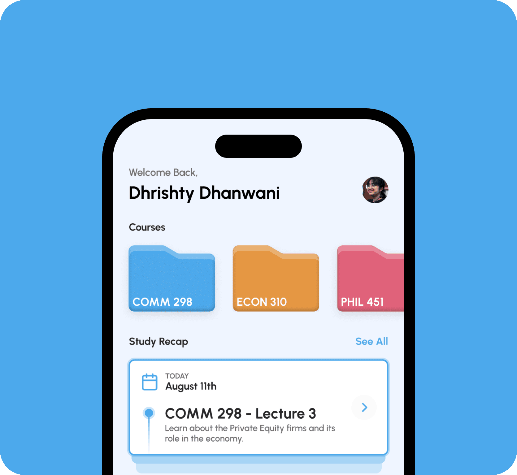
Mobile-First Accessibility
Moving to an iOS ecosystem wasn't just about a smaller screen; it was about leveraging mobile familiarity to humanize the AI. I designed the interface to feel friendly and recognizable, reducing the perceived complexity of the tool. 50-65% of 100 users we interviewed preferred studying on their iPad rather than a laptop. They found it lighter, more portable, and better suited for class environments.


The Micro-Details
To ground the digital experience, I designed a signature card-stacking animation for the task dashboard. This micro-interaction provides a sense of physical accomplishment as users move through their learning modules.
To ground the digital experience, I designed a signature card-stacking animation for the task dashboard. This micro-interaction provides a sense of physical accomplishment as users move through their learning modules.

The Results
By shifting to a mobile-first, value-first strategy, we eliminated the onboarding friction.
Key Metric: A 30% reduction in misclicks and a more cohesive, professional brand identity that scales across the entire product ecosystem.
Back to Top