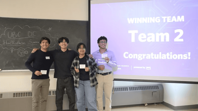
Polaris was built during the UBC x AWS GenAI Hackathon, where teams had 8 hours to create a GenAI-powered solution using cloud computing. We designed a tool that helps people explore careers more meaningfully.
CORE TASK
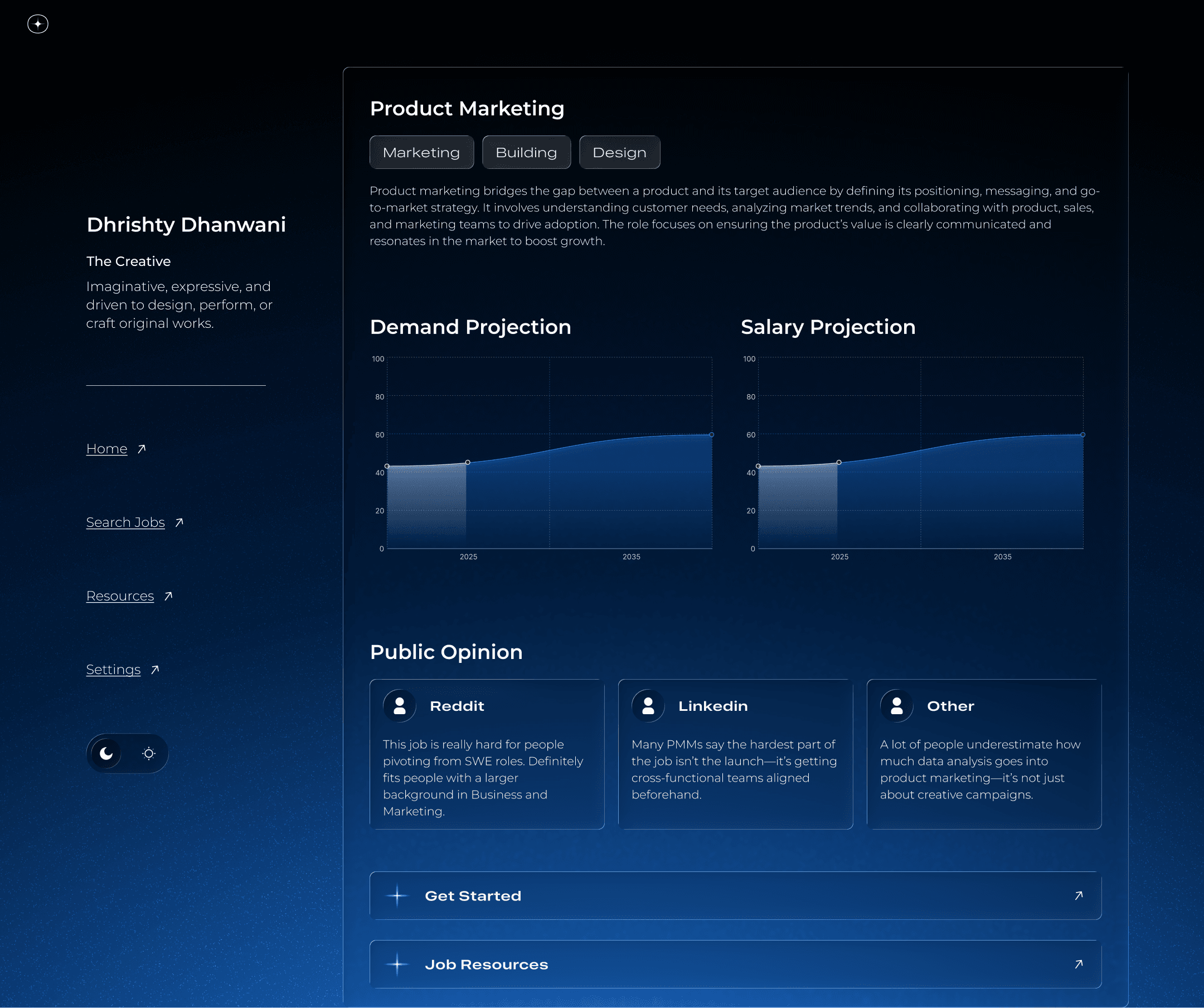
WHY USE O*NET
900
different occupations are available in its database. As our project was meant to help as many people find the right career path, we believe that this data would be comprehensive enough.
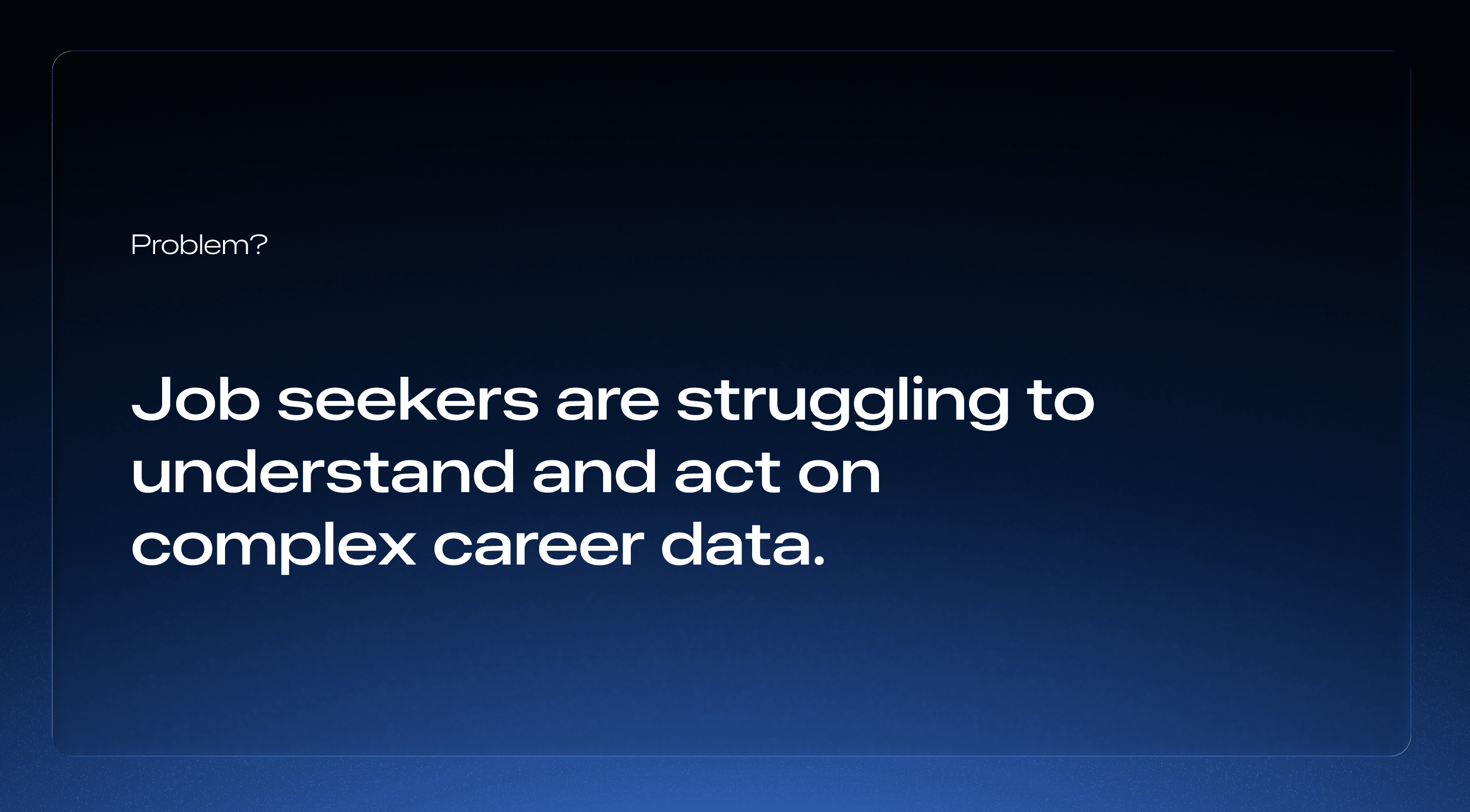
The Problem
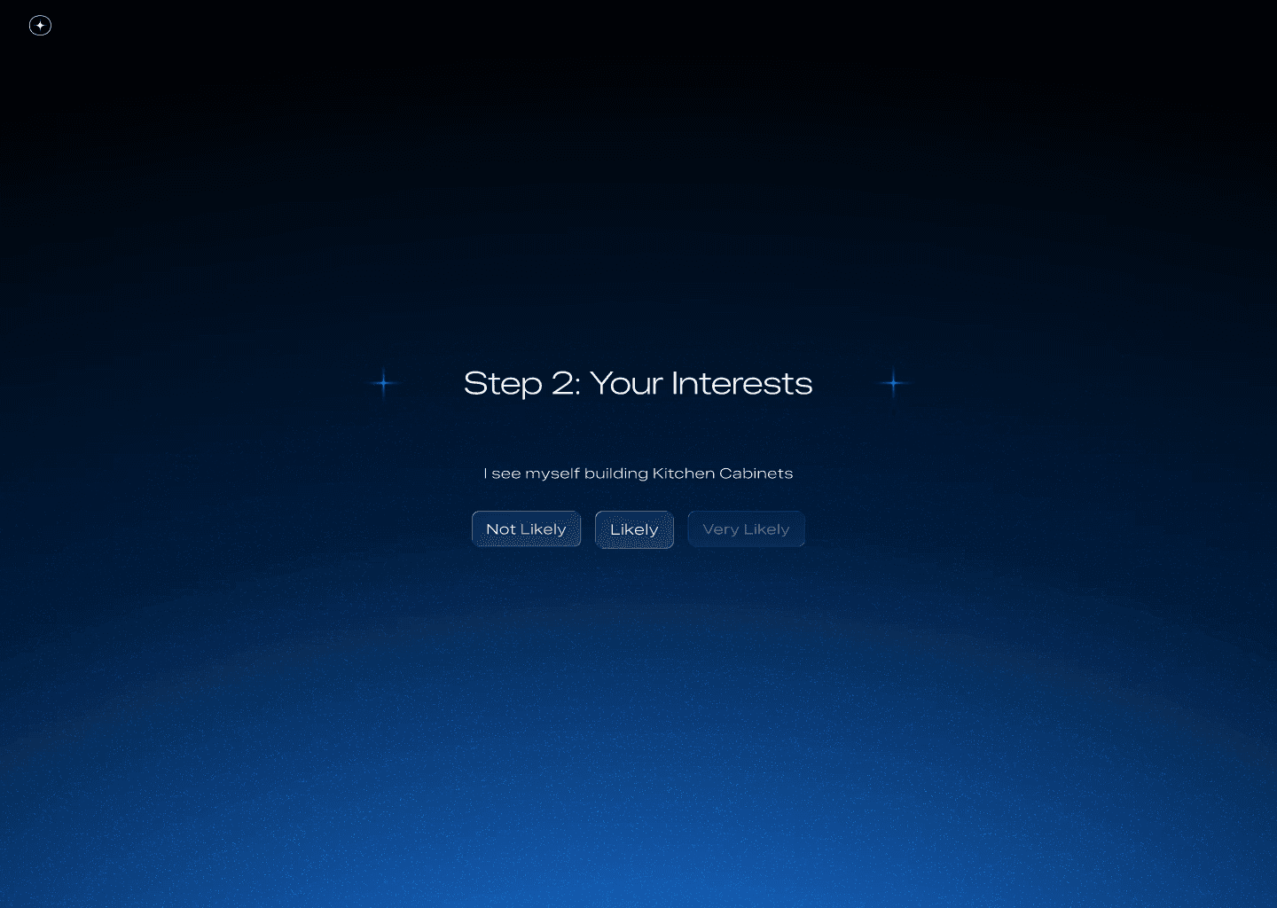
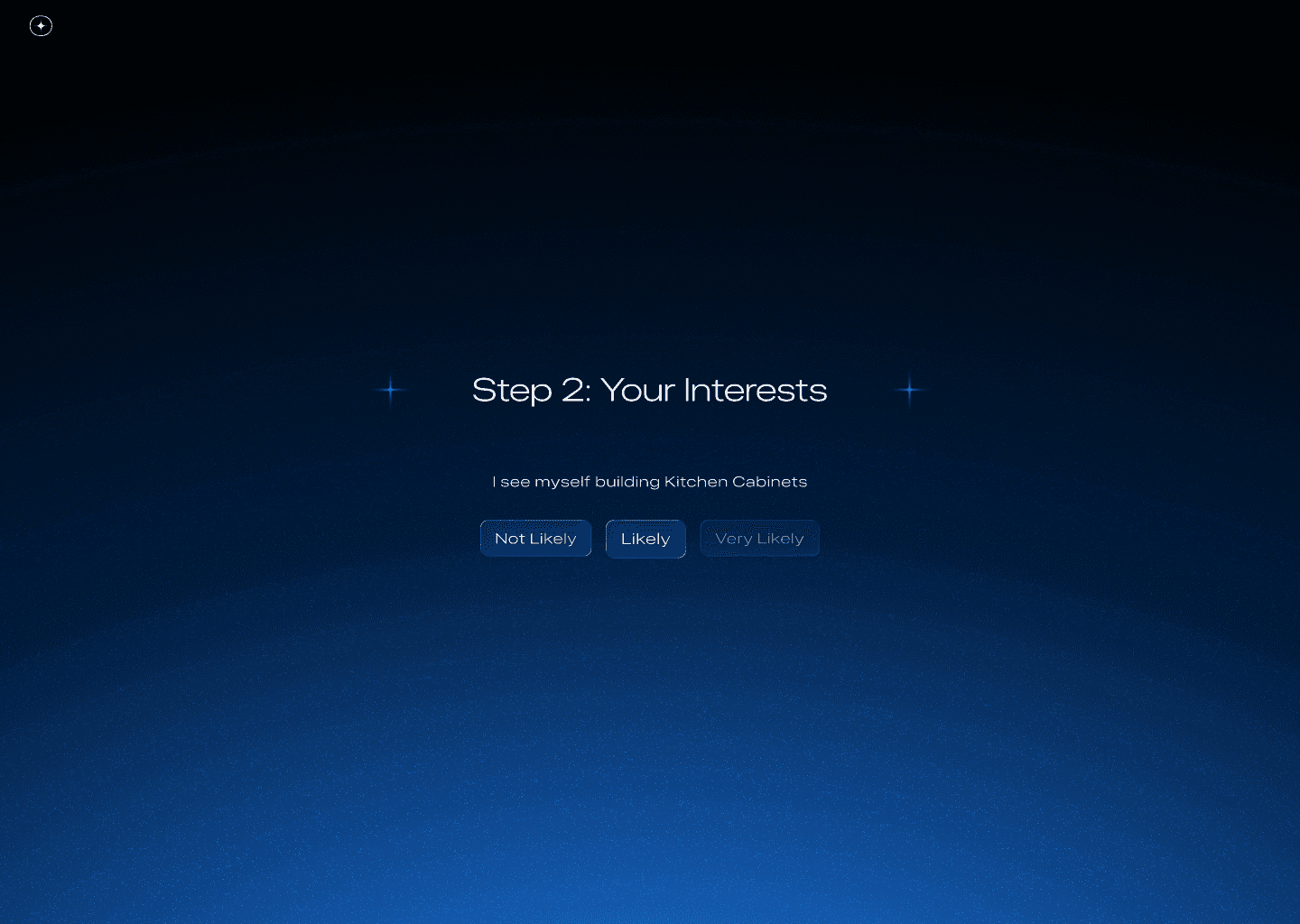
Most job platforms feel transactional you search for keywords that interests you, get a list, and that’s it. We wanted to humanize that process. Our team noticed how job search anxiety often stems from too much data and not enough emotional context. So, we decided to build a system that connects personality and job data, making career discovery more reflective and engaging.
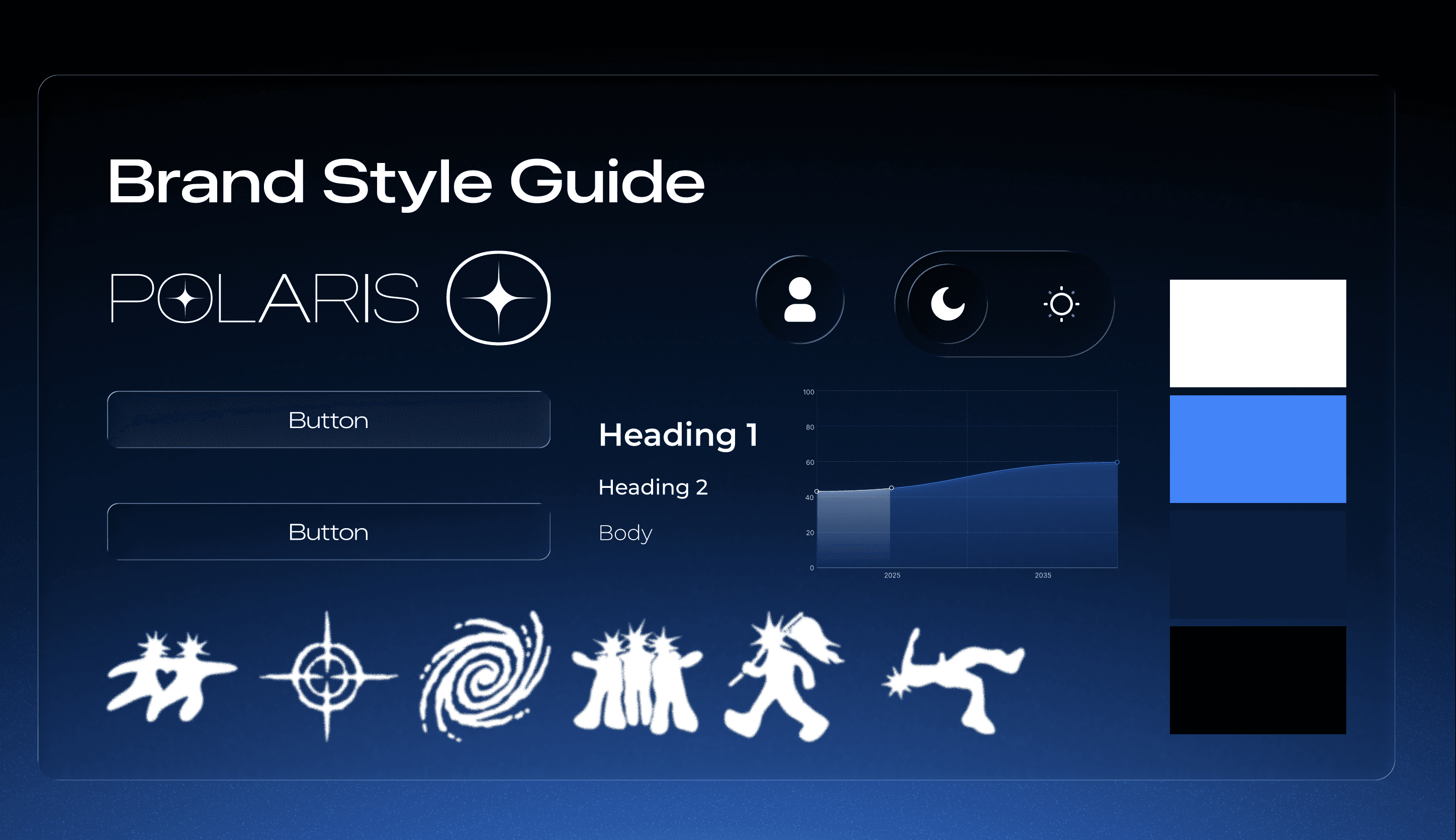
Overview
In just 8 hours, I built 10 polished Figma screens covering everything from onboarding to dashboards. Every interaction was designed to reduce friction — the visuals were clean, empathetic, and flowy, inspired by how people naturally explore ideas when uncertain about their next step.
I also designed the final pitch deck, helping frame our narrative around reducing job anxiety and building emotional connection through design.
Subtle animations and transitions were added to create a smoother, more natural browsing experience.
Designing Through Ambiguity
This project taught me how to design through ambiguity, especially when dealing with AI and data-heavy systems that have no precedent. You don’t always get a clear direction, but if you start building and refining fast, the clarity comes later.
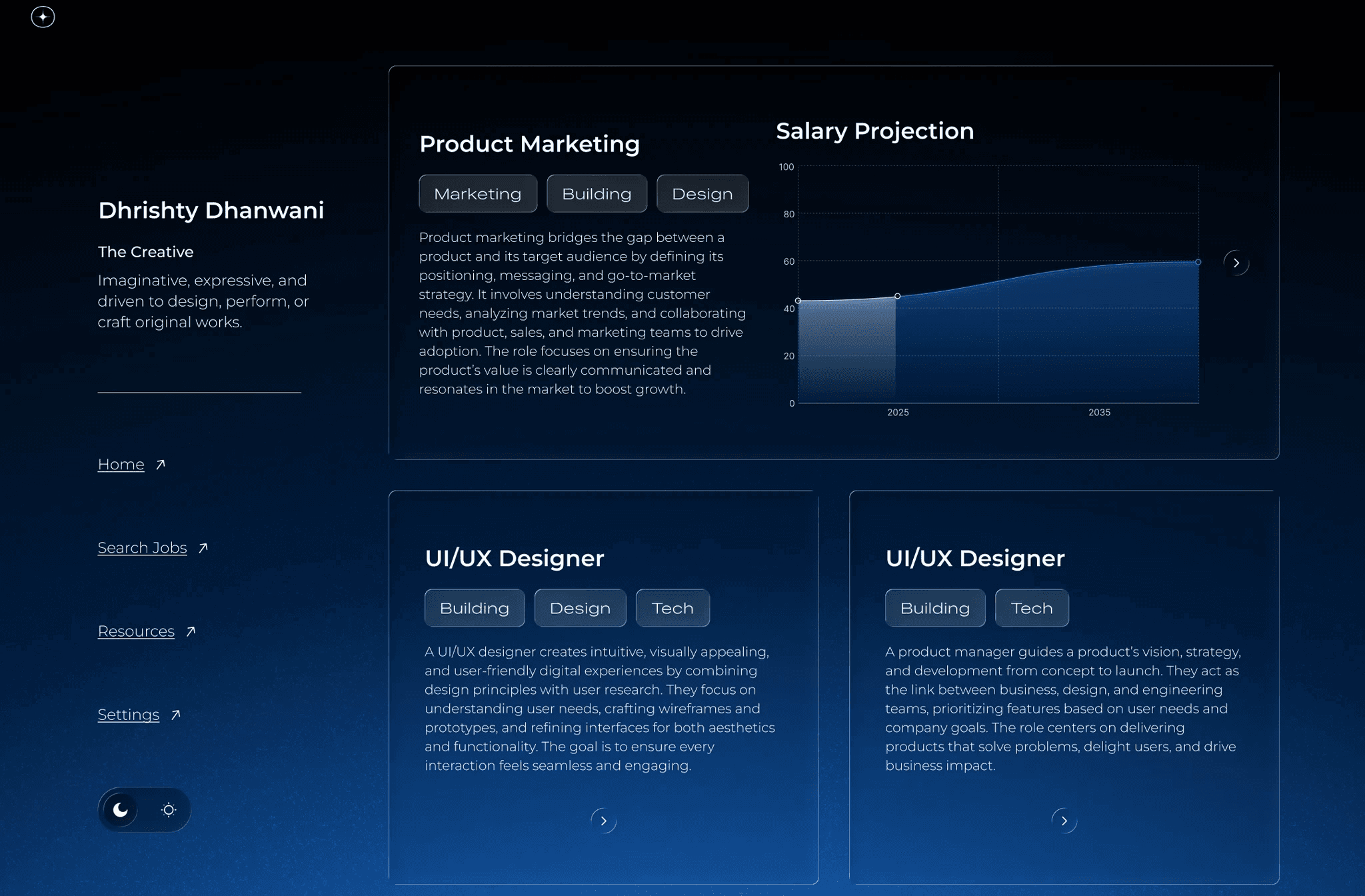
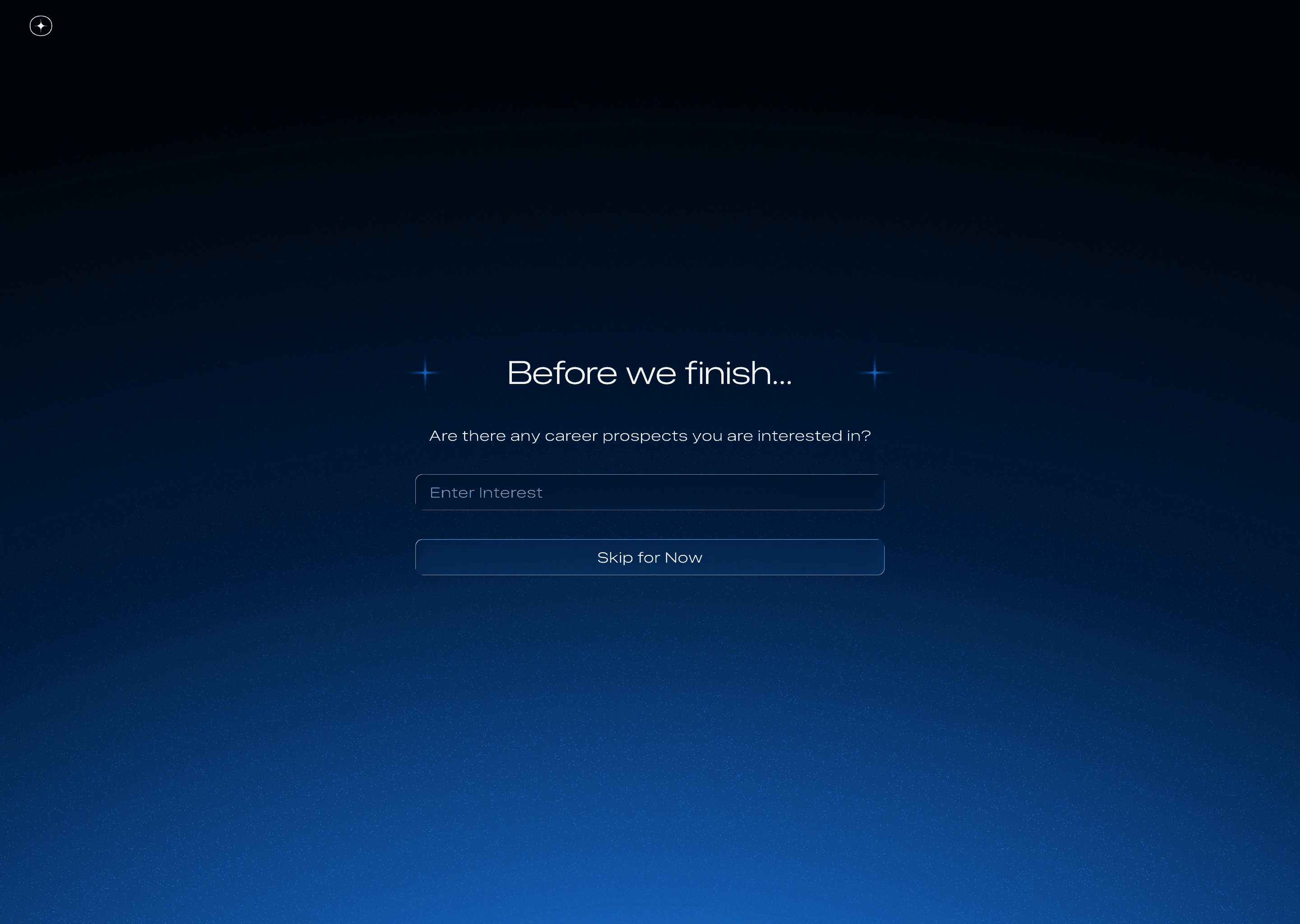
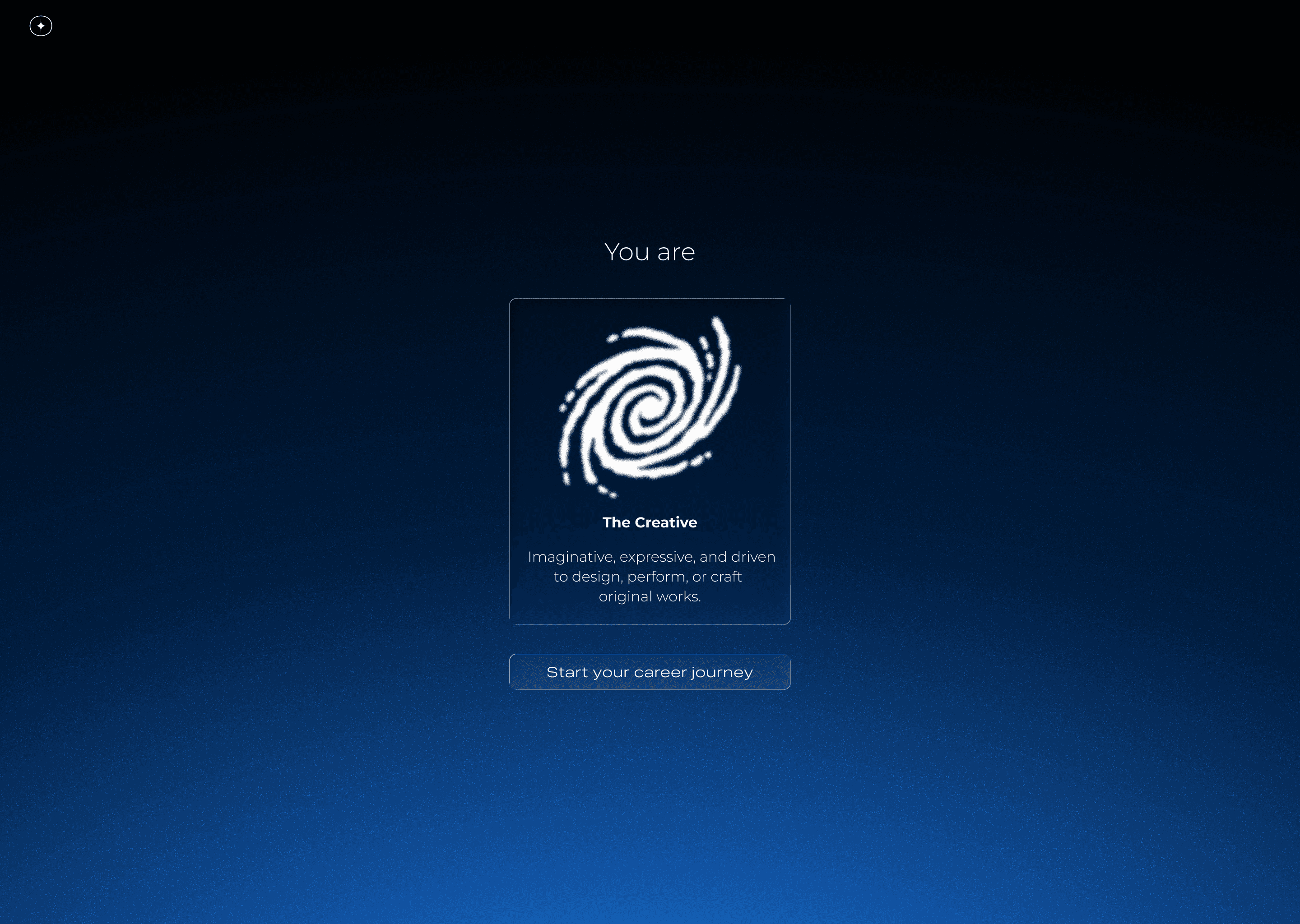
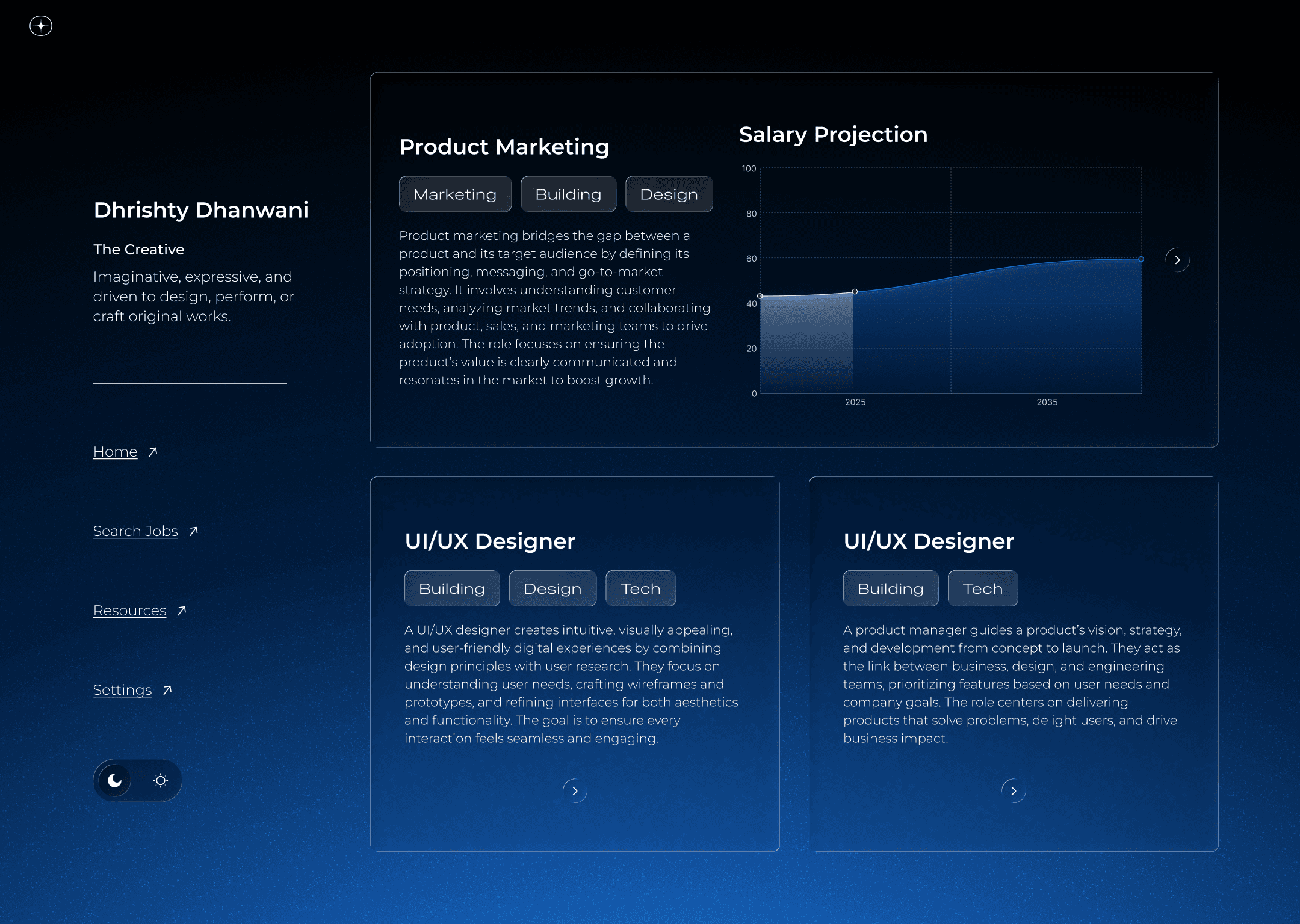
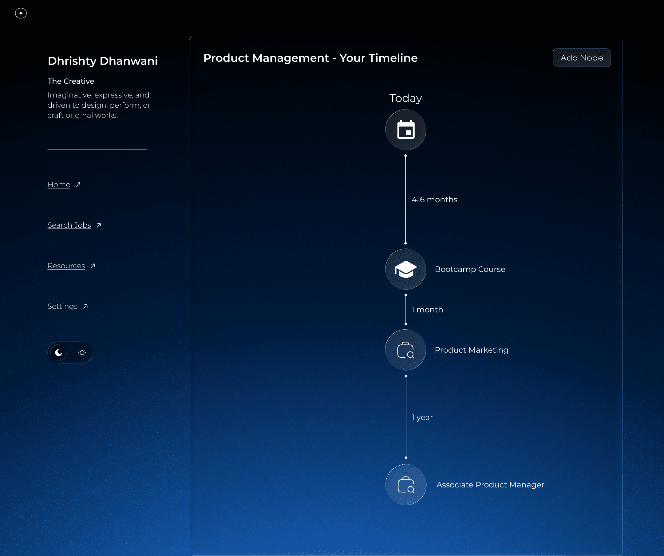
This was reflected in one of our features, where I had to design different personalities that users can get after our personality quiz, which will then help them find their "perfect" job.
Results
Our prototype was one of the few that worked end-to-end during demo day, we had absolutely no glitches, just flow.
The judges loved the cohesive visuals and clear storytelling.
We ended up winning 1st place, standing out for our execution and empathy-driven design.
Key Learnings
Clarity and Consistency: Through this hackathon, I learned that there may be times where I would have to prioritize clarity over complexity when visualizing AI-driven data to help with maintaining a consistent tone and visual rhythm under tight time constraints.
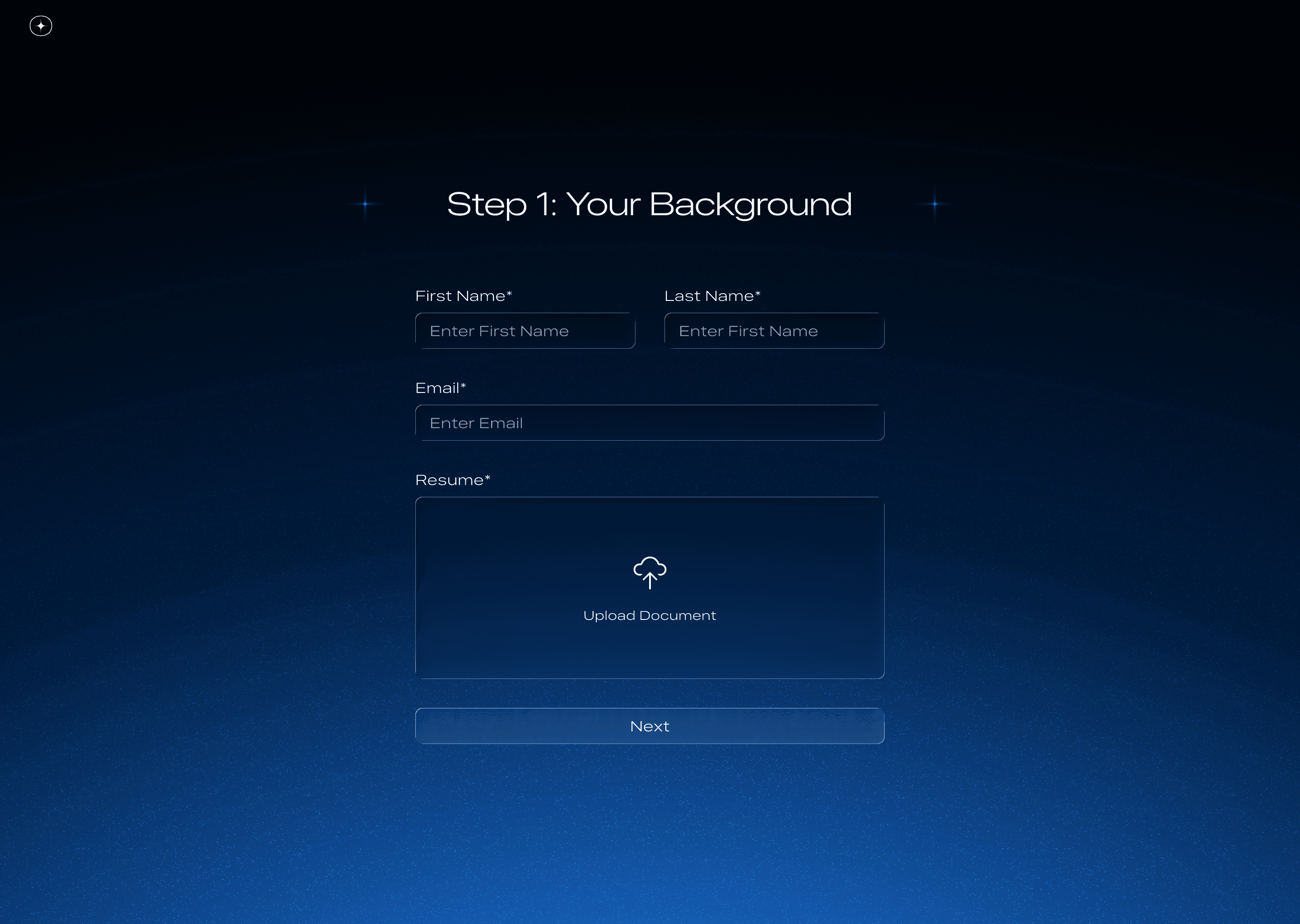
Communication
As the hackathon was less than 12 hours long, it is important to communicate design intent quickly across different roles (developers, data engineers, presenters). This is a snapshot of a feature that could not be implemented on time.